Showing posts with label characters. Show all posts

Friday, May 7, 2010

The Wheel Of Fate Is oh nevermind.


BlazBlue's logo, in which all the letters are trying to desperately get away from each other as quickly as possible.

I'm not really here to fault BlazBlue: Calamity Trigger's recycling of characters from the Guilty Gear series. Arc System works is small and not all that wealthy and making detailed, high-res sprites is pretty costly, so I can understand if at some point they sat around the table, grabbed a general sketch of Potemkin, and thought, "Well, how can we re-use most of this and still make a pretty different character? You see, Guilty Gear 2 didn't work out so great, and..."

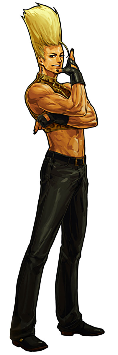
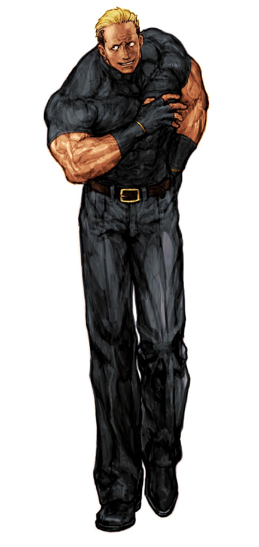
Iron Tager--Potemkin after Science!

What I really don't want to forgive BlazBlue for is its horrible, horrible character designs. I cannot stress this enough. They are bad. They manage to be both repulsive and utterly forgettable at the same time. Say what you will about their personalities, the storyline, the actual battle system and the quality of the sprites, but strictly speaking in terms of character designs, I want to headbutt Toshimichi Mori and/or Yuuki Katou, whoever is the most responsible for this mess.

Maybe we should start with how every single character in BlazBlue seems to have been dreamed up by a man who was holding a What's Hot & What's Not chart of stylistic anime trends in his other hand, and following it to the letter. Exhibit A: Ragna the Bloodedge, a name not quite as embarrassing as "Edge Maverick" but still pretty up there.

Ragna the Bloodedge, also featured: his inner .::*Darkness*::.

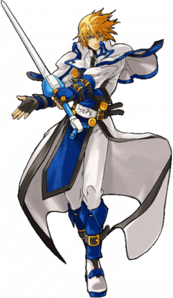
Ragna is kind of an amalgam of various things that I am tired of seeing in anime: swooshy-spiky hair of a color that doesn't really exist (there's gray, there's platinum blonde and then there's sterling silver) coupled with a twenty-third century samurai getup, with additional belt buckles for good measure. When I saw the animated opening to the game as Ragna displayed his Suiseiseki eyes to music that could well be featured in a Rozen Maiden spin-off, I just wanted to think "No, this isn't serious, the eyes are just a parody by the designers, who are of course self-aware of how wall-punchingly generic this guy is", but no, the opening continues, Ragna gets into a dramatic sword fight with Jin Kisaragi (read: Ky plus Ice), and the drama unfolds. That's Ragna for you: a Sol Badguy tweaked for modern sensibilities.

Noel Vermillion sports the world's shortest tie

A side-effect of trying to cater endlessly to the contemporary anime crowd is the attempt to cram way too many things into one design. I can only imagine that Noel is the result of Mori and Katou making a bet on who could come up with a character who featured as many fetish evokers as possible. Her infuriatingly useless ribbons and Apple-designed handguns are one thing; her detached sleeves, bare back and absolute territory are another. (Even sadder is the story of Litchi, a vaguely oriental chick and also the vehicle for more boobs.) BlazBlue's character designers enjoy the technology to reproduce all their zippers and straps in-game with some degree of fidelity, and this doesn't seem have done any good for their judgment of when a design is way too goddamn busy. Echoing on my post regarding the character designs of Rival Schools, I'd like to put these guys in the PS1 era and see what they did with themselves.

I guess the amateurish quality of the art is not doing them any favors either. Character portraits for BlazBlue: Continuum Shift are at least a step up in this regard, with the fighters in more interesting and dynamic poses.

You know, the Guilty Gear games also had some pretty crazy character designs, but they existed in this magical midnight metal carnival sort of atmosphere that characters like I-No embodied so well. The cast of BlazBlue is given a bland synthpop world in which they can just exist while looking pretty and lending themselves to endless badly-drawn fan art. It's not even elegant, it's just... boring, and you know people will lap it up but that will not make it any less boring.

Thanks to Creative Uncut for images.

Monday, May 3, 2010

Ryuusei KIIIIIICK!!


I've always been partial to many of Capcom's in-house artists for many different reasons. A big reason is their healthy emphasis on functionality.

Given how Capcom invented the modern fighter, I imagine that many of their founding character designers must have sat down and looked at this new breed of video game and realized that characters had to be explosively appealing. There's a flimsy vestige of a storyline and a few win/lose quotes, but most if not all 'character development' is going to take place on a two-dimensional battlefield, with fluidly-animated sprites to answer any questions. Not the sillier questions like "Why is he fighting?", which would only spring forth from someone with a well-cemented interest in the game, but more immediate questions like "What does this guy do? Is he awesome?"


Edayan is in the high tier of Capcom artists, and has contributed to the Street Fighter series countless times. He was also responsible for designing the cast of the sadly forgotten tag-team fighter Rival Schools: United By Fate, a game about dueling high school students where every other character profile includes the term "hot-blooded". It looks, plays and inspires like a passionately-drawn shounen manga does.

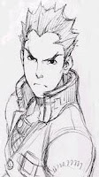
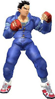
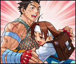
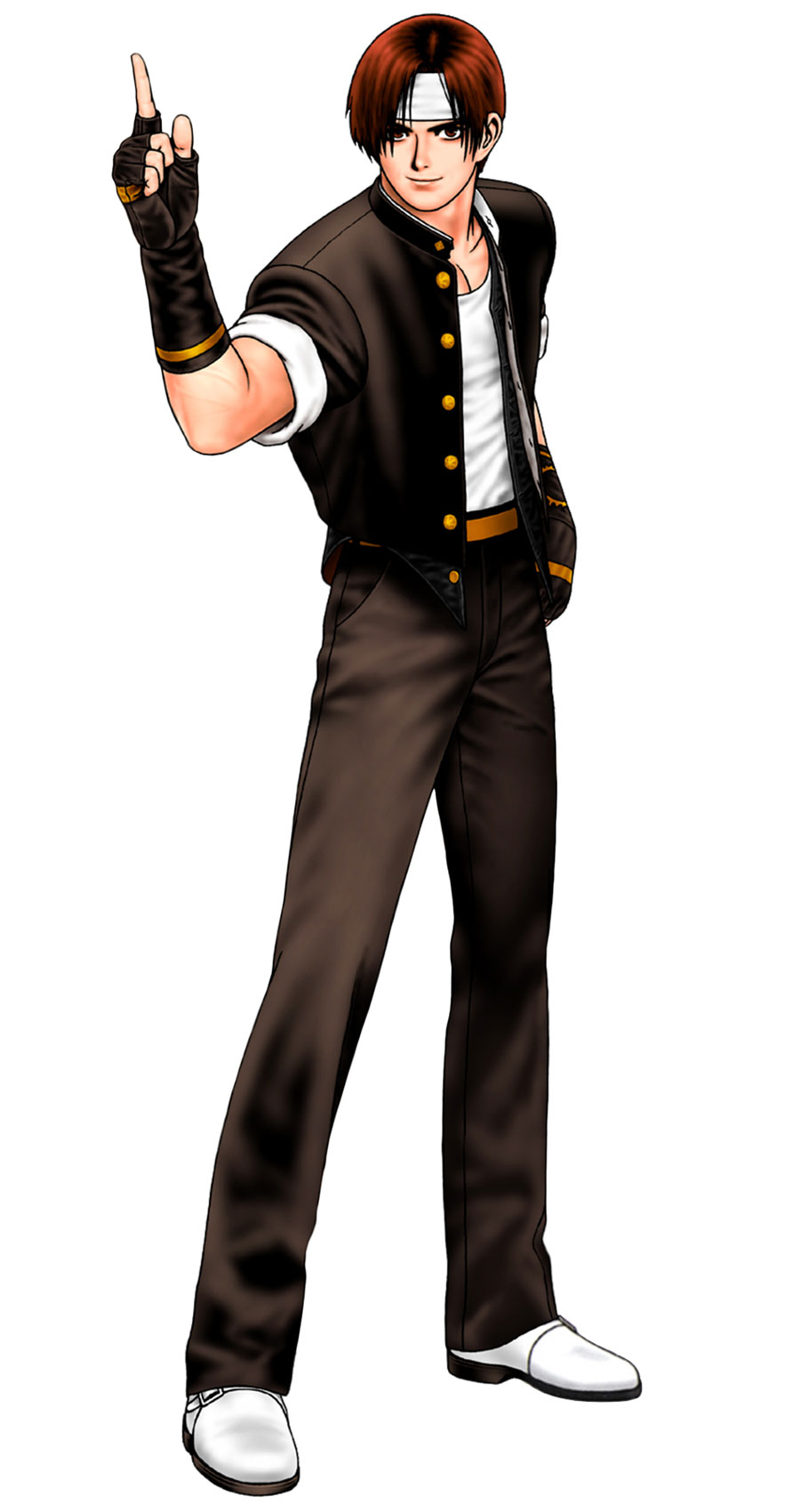
Batsu Ichimonji, P.E. enthusiast and protagonist of the two-game series, exudes the raw, youthful, organic drive that The King of Fighters' sleeker Kyo Kusanagi, who also started off as a uniformed schoolboy, doesn't really capture. If he calls out the names of his attacks, which are things like "Justice Kick", and suddenly scarlet flames envelop his leg as he dropkicks you into the Moon, you will understand that this is what Batsu does. Even though Rival Schools for the PS1 was a bit of a graphical mess (moreso for some characters than others), his defining features, the way in which every part of his outfit, appearance and personal style cooperate to form a coherent portrait, shine through the limited technology.


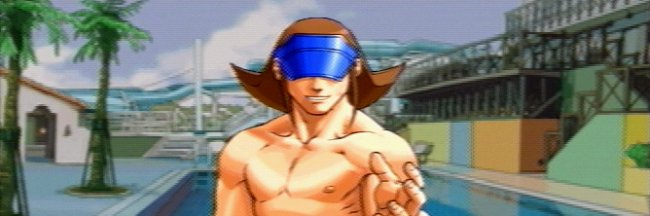
Long before Persona 3 capitalized on Westerners' fervent desire to play as a Japanese high school student, Rival Schools included a day-by-day, life-simulation side-game where you got to know the characters better. [It was left out of the NA release.] This was the kind of thing that senior artists like Akiman and CRMK perhaps didn't anticipate when Street Fighter II was still in the works, but instead of promoting looser design, Rival Schools continues to tell the majority of its story with pictures. The exclamation mark-laden dialogue, full of earnest promises and friends cheering friends on, is almost an accessory to the many visual clues that, for example, visiting the characters at the pool or the beach would provide.

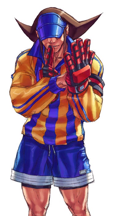
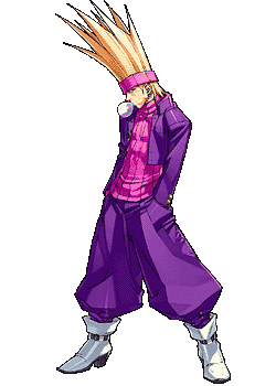
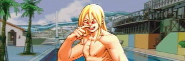
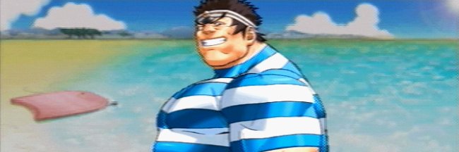
Roberto Miura plays soccer. We know that much from his outfit, and it makes sense when he lobs soccer balls at opponents in battle. The fact that he wears his face-covering visor even to the school pool adds another layer of teasing interest to him; are we ever going to see his eyes? Is he like one of those characters from some TV shows that is never shown from the neck up? The fact that Edge, a purple-clad punk who looks like the lovechild of Benimaru Nikaido and Ryuji Yamazaki, lets his unicorn-hair down in the pool says just about as much on him. Why does Gan, whose bulging muscles can barely be contained by an XXL uniform, wear a full bathing suit? What the crap is he afraid of?

When the studio behind Street Fighter II decided to invite a cast of warriors from around the world into the ring, this concept of characters wearing their nationalities, hobbies and personalities on their sleeves must have weighed heavy on the designers' minds. It's a philosophy that was carried on marvelously to Rival Schools, where Justice High School (for full effect, say that out loud and say it intensely) is alive with little everyday scenes. You can imagine spectacular martial arts showdowns taking place over lunch, in the showers, during the last inning of a baseball game. This is the kind of memorable design that I greatly respect most Capcom fighters for; it's coherent, unified and masterfully executed, and it's more than I can say for many contemporary games in the genre. Maybe that makes the characters cartoons--it almost certainly makes the whole game a cartoon--and I personally love that.


Thanks to The Fighters Generation and Creative Uncut for images.